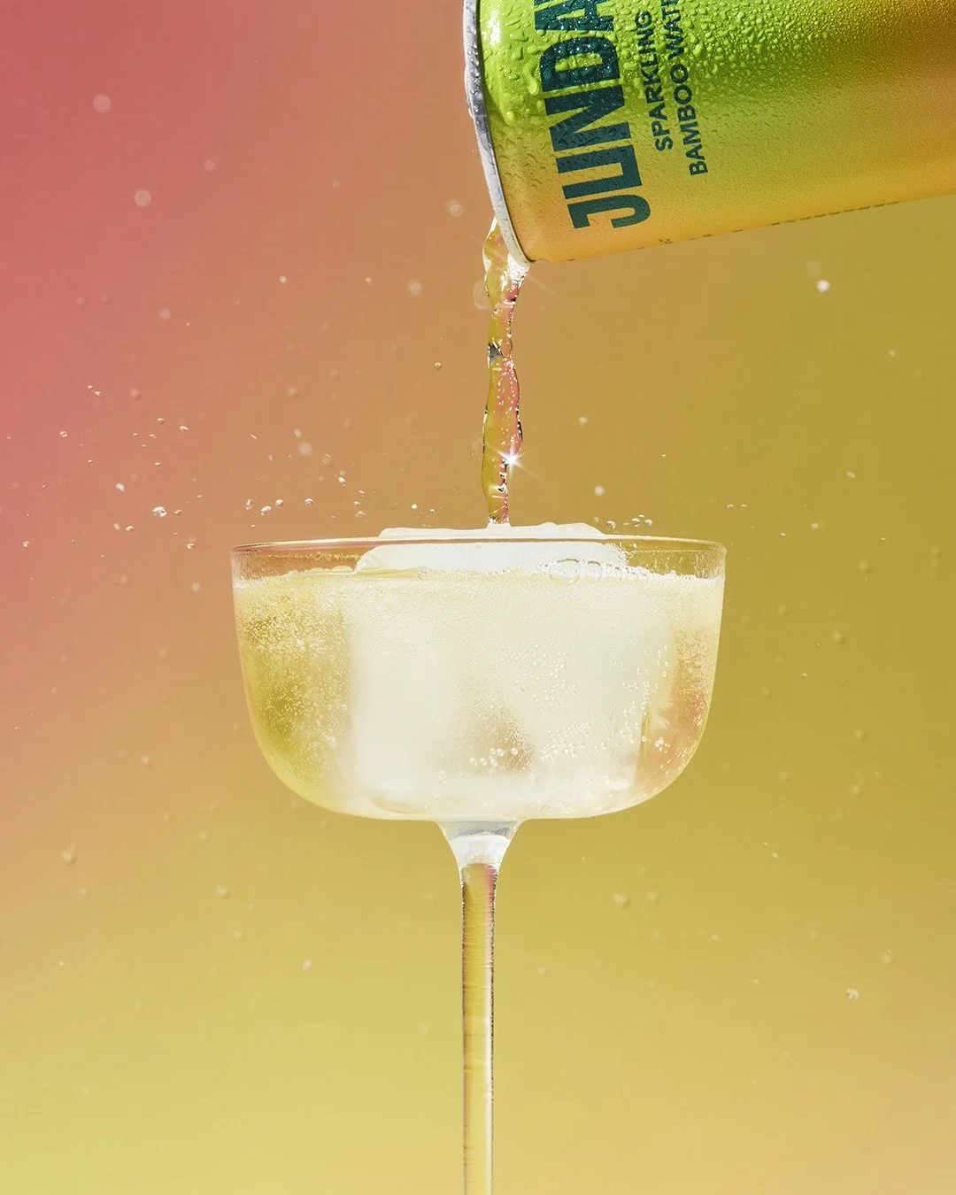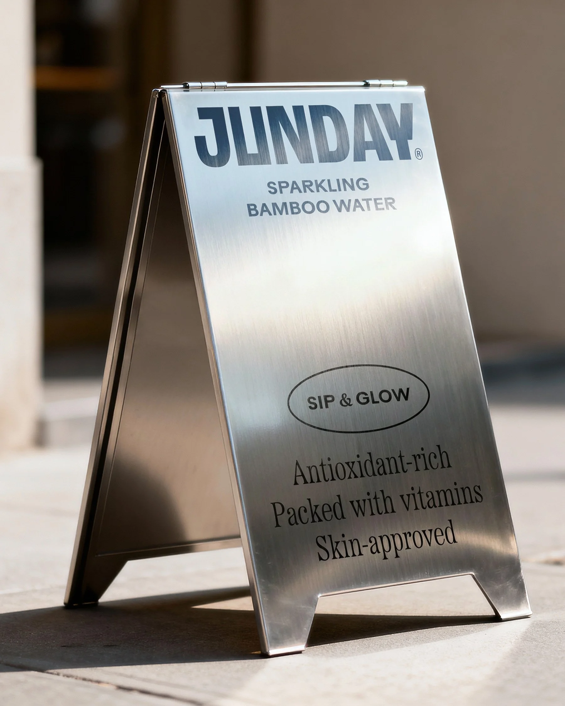
JUNDAY
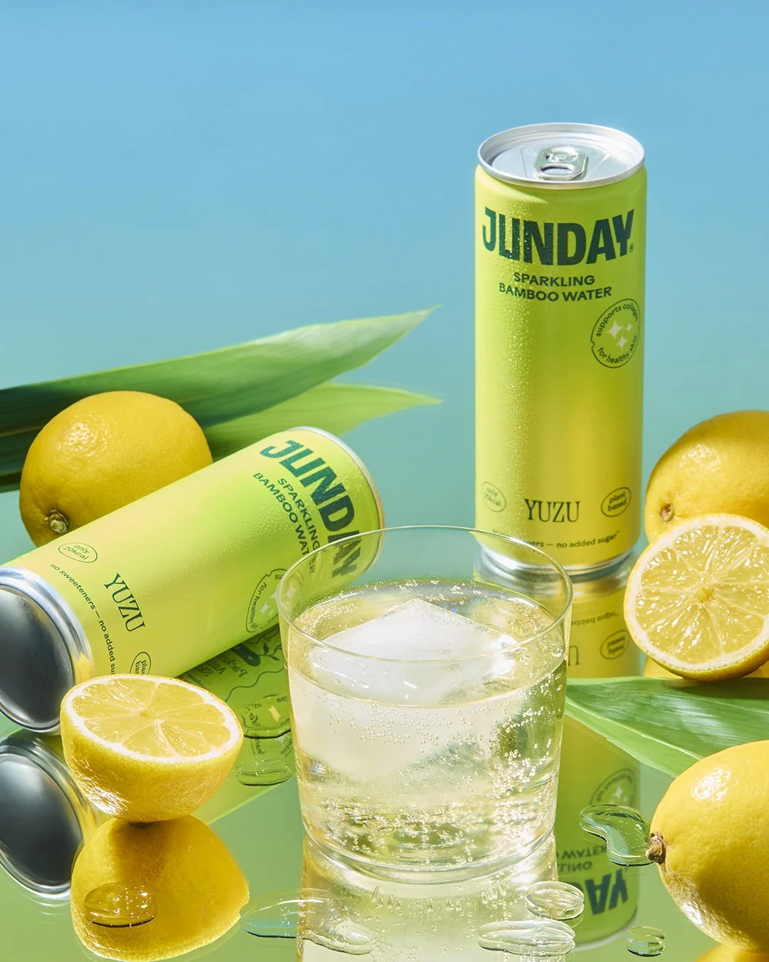
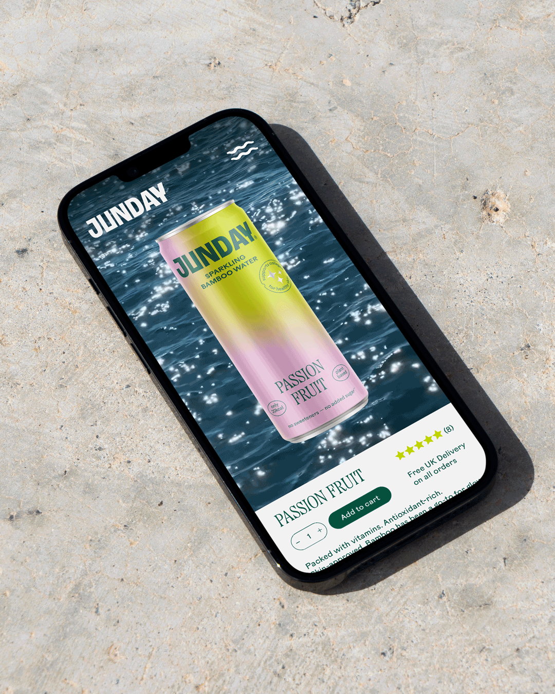
Sparkling Bamboo Water
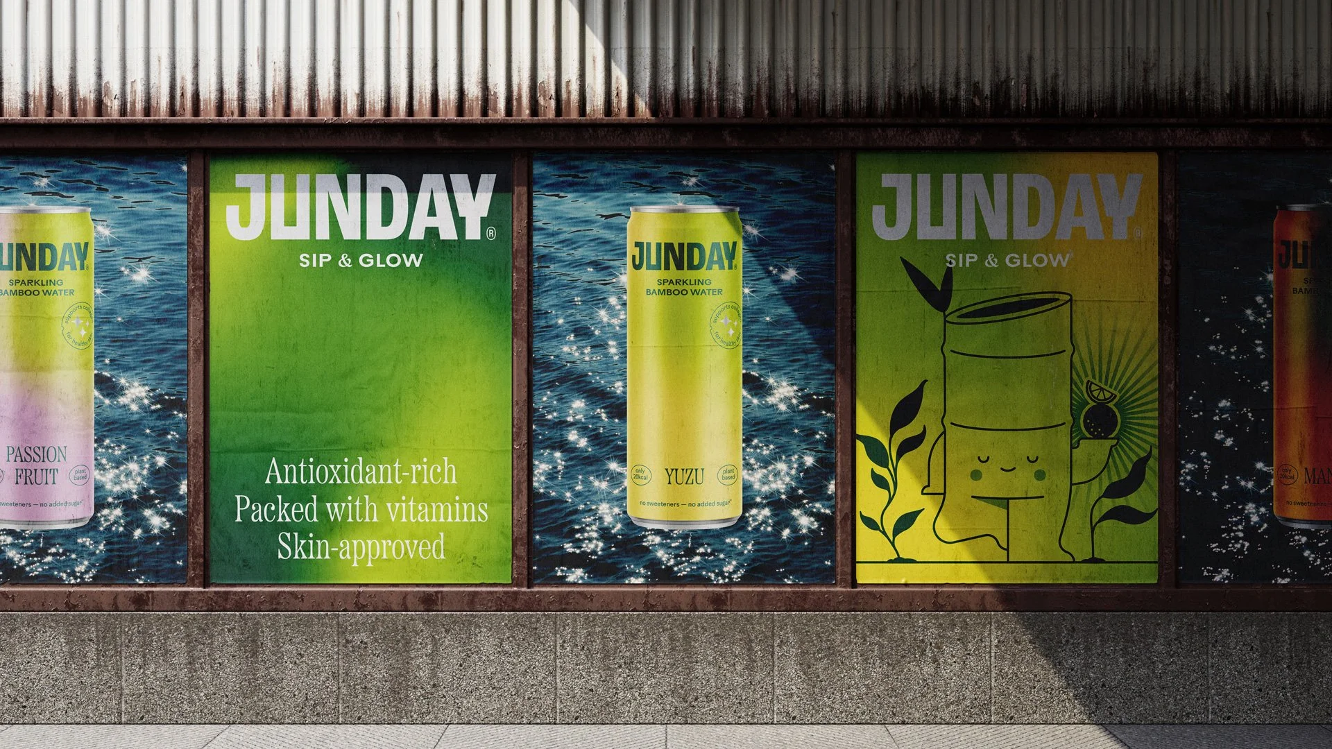
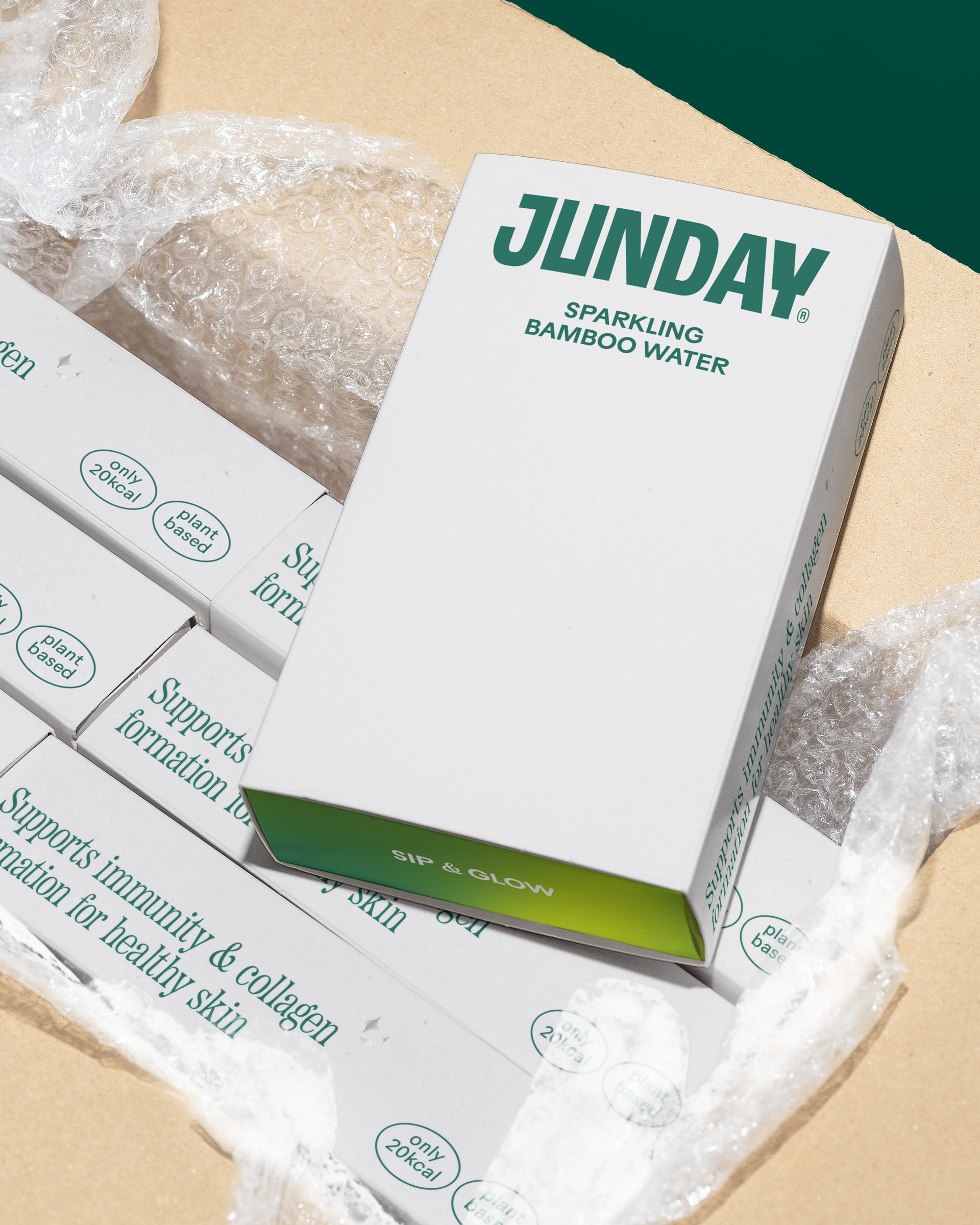
Brand Identity and Packaging
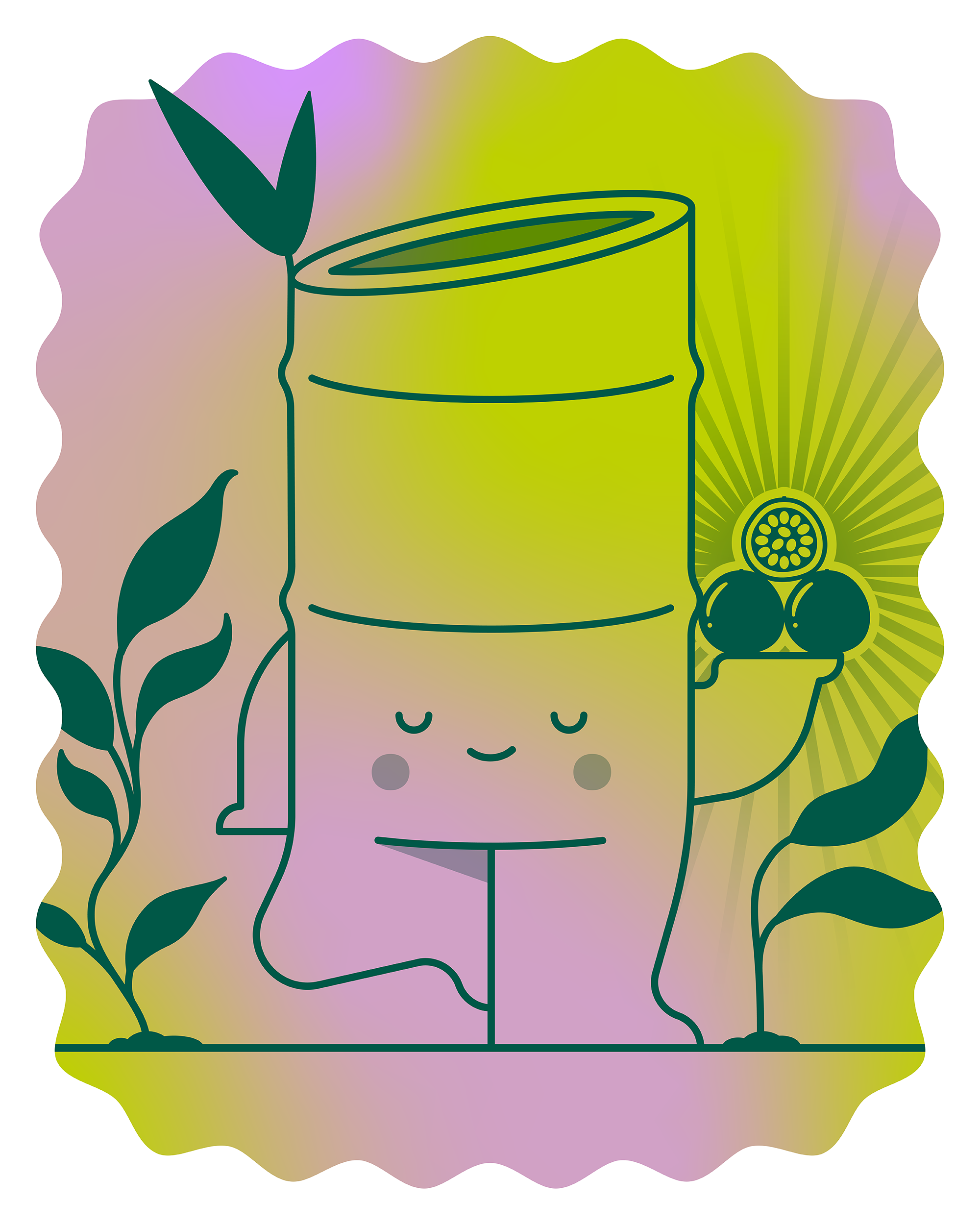
JUNO’s journey began in Asia, where their founder, Guillaume, stumbled upon bamboo extract in a local apothecary. There was a buzz surrounding it and he wanted to know what all the fuss was about. Turns out, bamboo has been used in traditional Asian medicine for centuries to support immunity and glowy skin. Bursting with antioxidants, vitamins and minerals, this ancient supergrass has all the perks of your fave skincare products without all the fake stuff.
So he wondered, what if you could put all that goodness in a can?
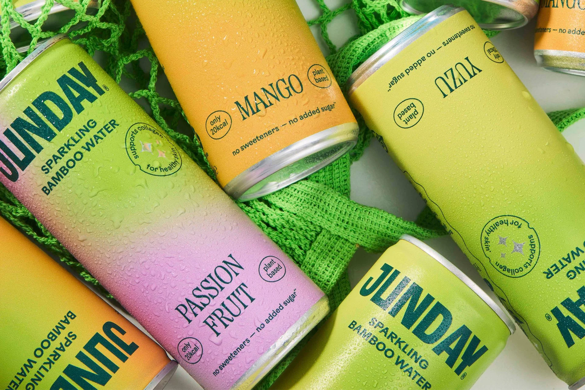
Guillaume and I originally began working together in 2023 on a simple packaging design brief as he looked to build beyond DTC. The next couple of years saw healthy growth, which included adding a third flavour to the range, getting stocked in the likes of Selfridges and growing international interest.
Fast-forward to 2025… expansion beyond the UK, beyond drinks, and with a bigger ambition: to build the world’s first wellness brand, powered by bamboo. They needed a name that could grow with them (and could be globally trademarked). The meaning? "JUN" — Japanese kanji for pure, clean and simple. "DAY" — Wellness should be a daily ritual.
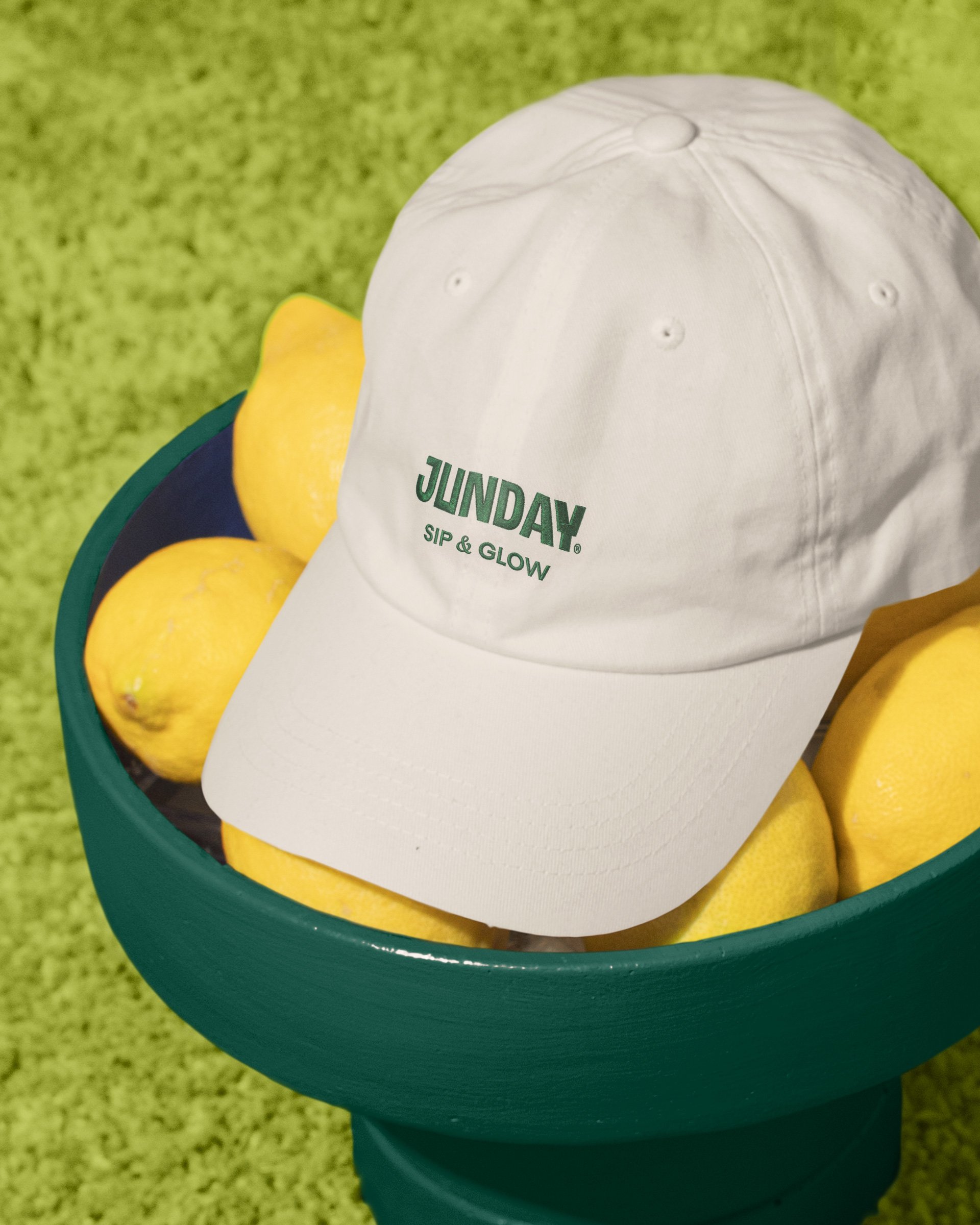
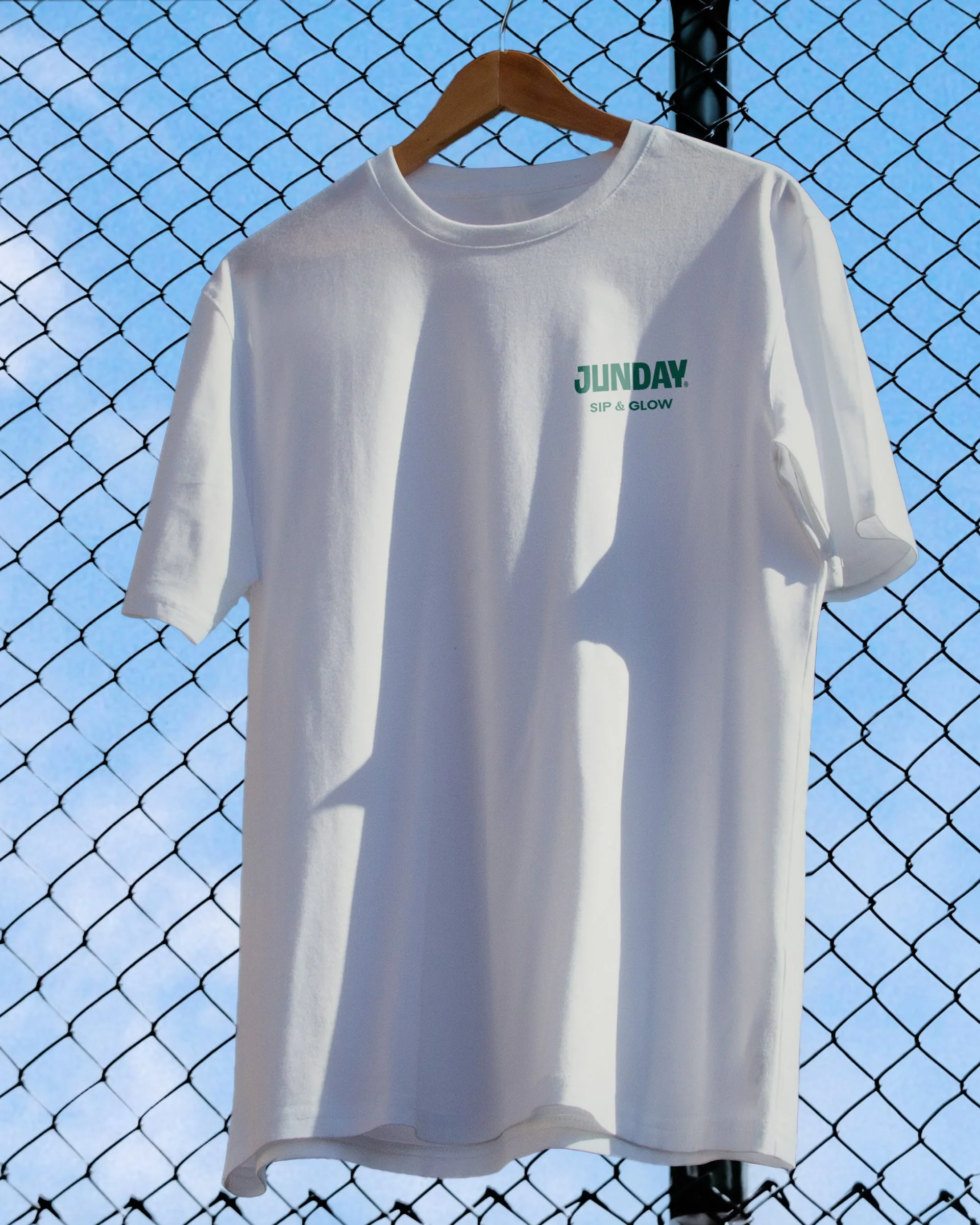
In-line with the name change, it was important the brand evolved rather than reinvented itself, so existing drinkers recognise the products on-shelf, whilst attracting new customers with a clearer proposition. Building on what people loved about them already, I developed the visual language and tone of voice, setting the brand’s foundations for years to come.
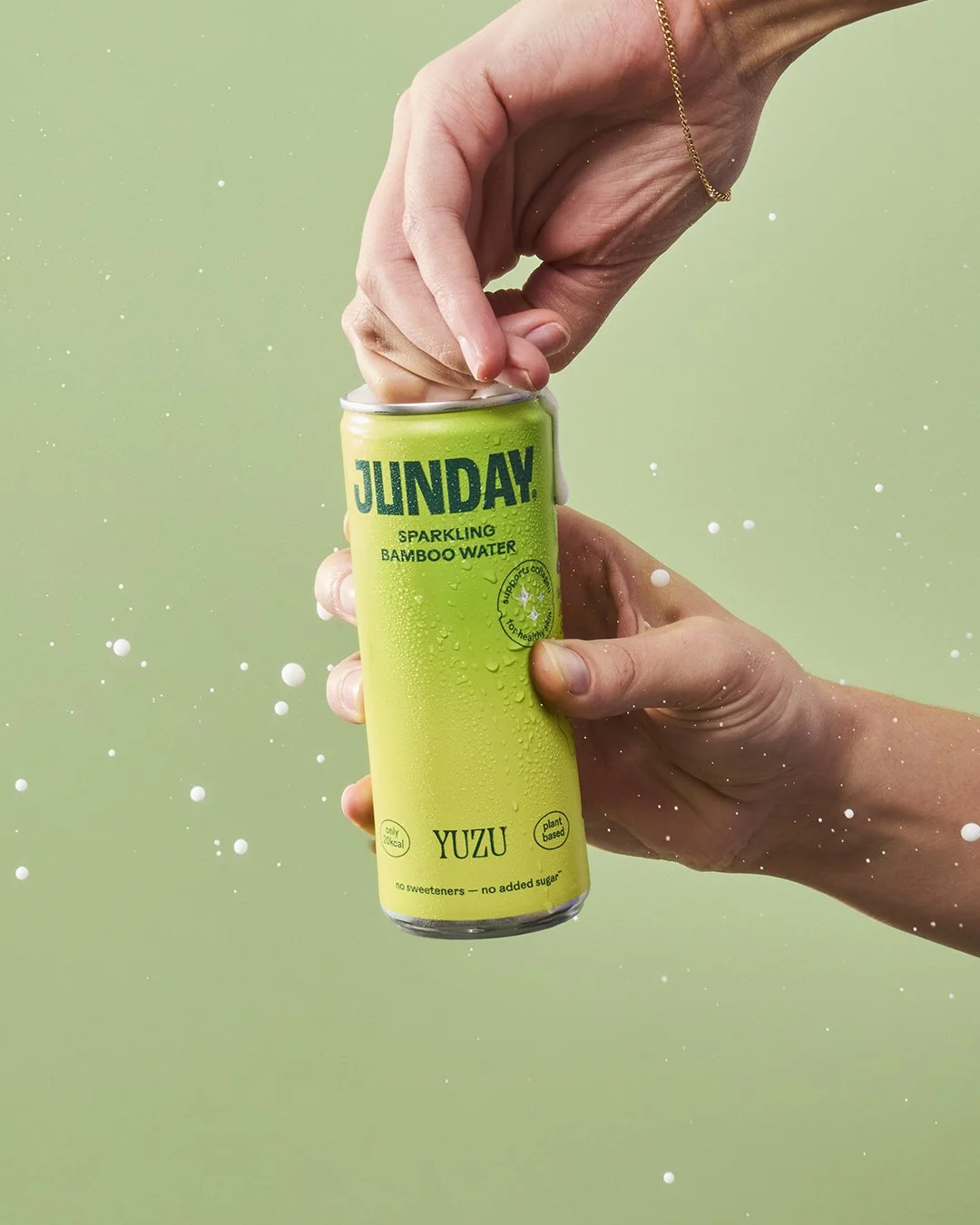
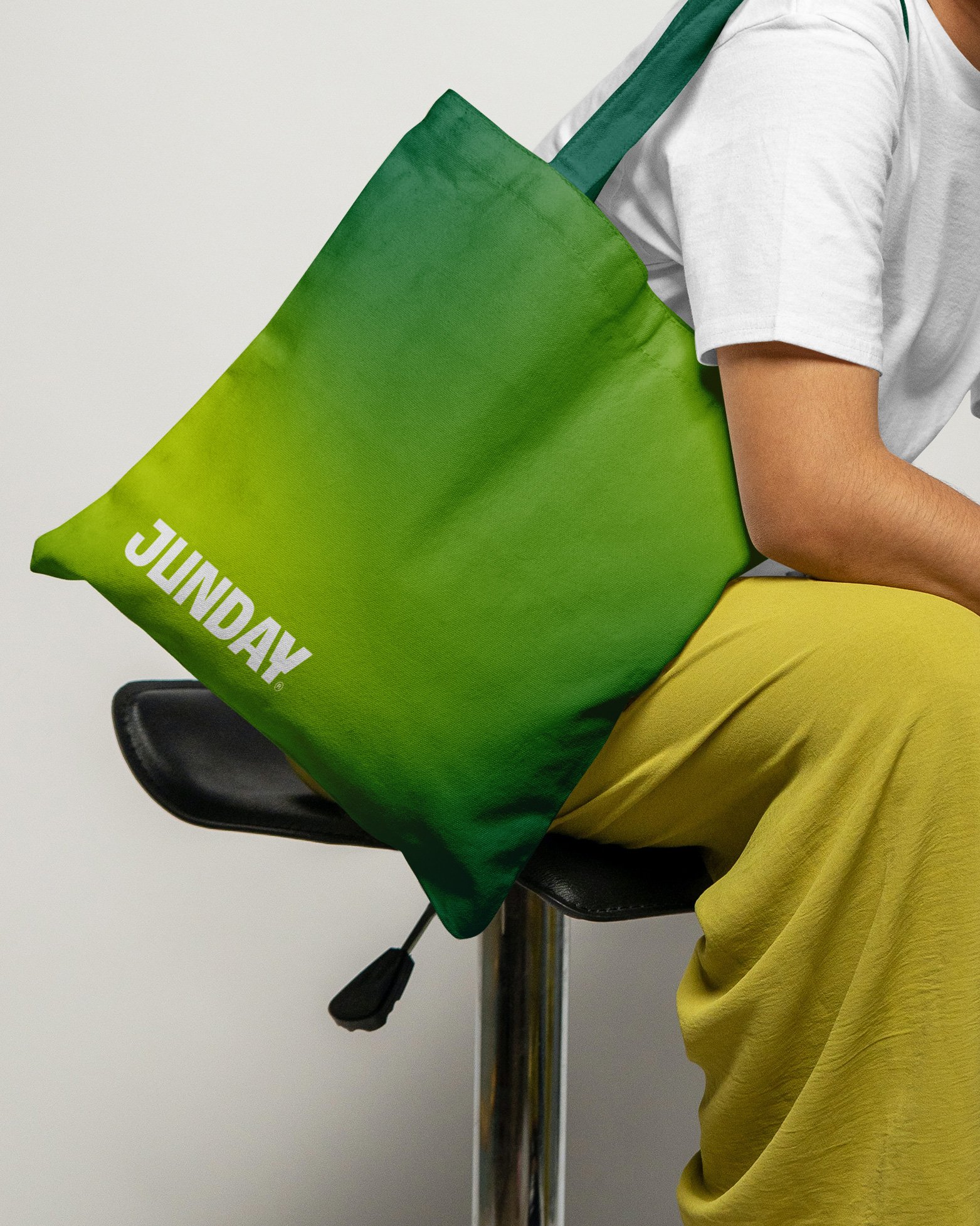
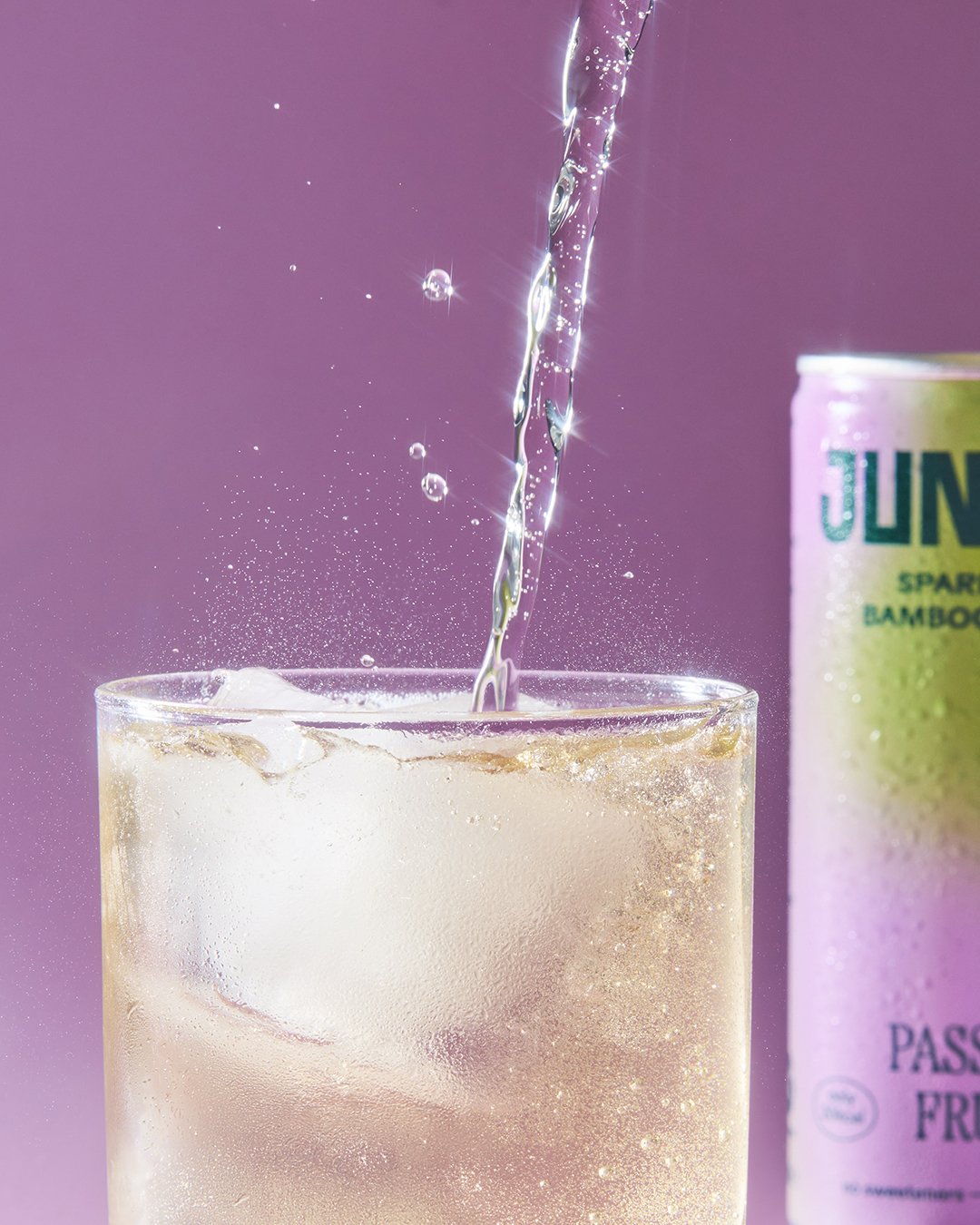
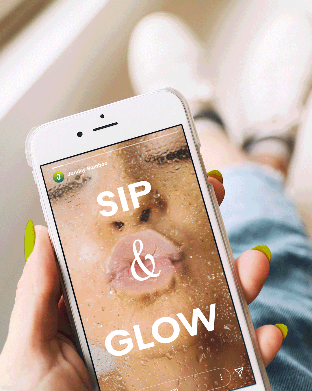
Bold, bright and brimming with positivity, JUNDAY fits seamlessly into everyday life. There’s a modern functionality to the brand that shines with calm confidence — from images of real people and natural ingredients to a vibrant colour palette that's hand-picked from nature itself.
Copywriting: Stacey Carter
Photography: Amy Grover